
Embed the User Dashboard on your website
The default implementation renders the loyalty dashboard as a pop-up on your website. If you want to embed the dashboard on any of your pages, follow the instructions in this document.
Even when you embed the dashboard on one page, you can still use the pop-up dashboard on other site pages. However, on one page, you can have either the embedded dashboard or the pop-up, not both.
Benefit of embedding the dashboard
By embedding the loyalty dashboard directly into your pages, you enhance the user experience and encourage engagement and interaction. Members can access the loyalty features without interrupting their browsing experience, leading to higher participation rates in your loyalty program. This integration also allows you to maintain a consistent look and feel throughout your site, showcasing the full capabilities of the loyalty program more effectively.
Let’s get started.
To start with embedding, log in to the Zinrelo admin console and navigate to Design >> User Dashboard >> Advanced >> Embed Dashboard.
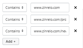
Step 1: Specify the URL pattern of the pages that will display the embedded dashboard. Indicate the website URL(s) where you want to embed the dashboard.
Step 2: Copy the code below.
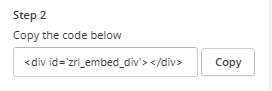
Step 3: Paste this code onto the specified pages at the location where the dashboard will be embedded.
Step 4: The code above is the HTML container element in which Zinrelo will insert the dashboard.
Please Note:
- Recommended sizes for this container are:
- Desktop: 800(w) x 850(h)
- Mobile: 370(w) x 625(h).
- The height and width mentioned in CSS are suggestive. It is highly recommended that you adjust these dimensions according to the resolution of the device being used. Additionally, ensure thorough testing before publishing.
Updated about 2 months ago