Blocks
Image Block

The Image Block allows you to add visuals to your email templates effortlessly. Supporting formats: JPEG, GIF, and PNG.
Options for Uploading Images
- Drag and Upload: Drag the image into the template or use the upload function.
- Pasting an External URL
- Paste the image URL into the "External link" field.
- For one-time use: Select "Leave as external link".
- For recurring use: Choose "Download to the gallery".
- Using the Personal Gallery
- Uploaded images are saved here.
- Use sorting (by date) or search by name to locate images.
- Insert images from the Project folder to make them accessible across all templates within the project.
Important Guidelines for Images
- File Size: Avoid using large PNG files as they can slow email loading times.
- Upload Limit: Maximum file size is 20MB, with a resolution limit of 4000 x 4000 px.
Text Block

The Text Block lets you insert and format text for your email, including headings and bullet points.
How to Insert Text?
- Drag a 1-column structure into your template.
- Add a Text Block or click the text button within the structure.
- Enter your text and format headings by highlighting the text and selecting the style from the top menu.
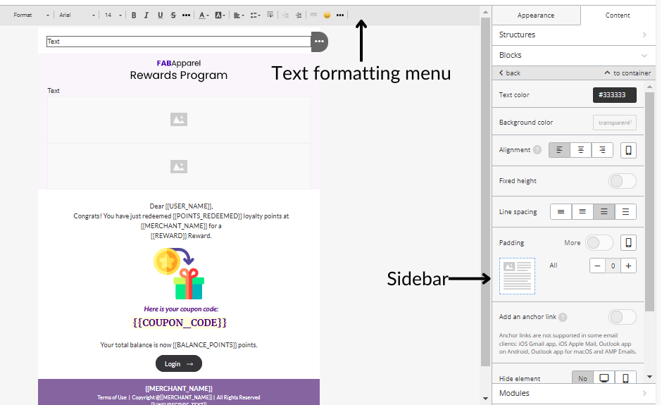
Settings for Text Blocks
When you select a text block, two settings panels become available:
- Sidebar
- Adjust text alignment, background colors, padding, and more.
- Text Formatting Menu
- Provides additional formatting options such as:
- Adding links
- Applying heading styles
- Choosing fonts
- Creating bullet lists
- Provides additional formatting options such as:
Button

Let’s explore how to create a CTA button utilizing the "Button" block:
- Drag the primary "Button" block into your template and position it next to the relevant element.
- Click on the "Button" block within your template to open the Settings panel.
- Add the desired URL link.

- Input your button text, also known as the button label.

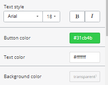
- Customize the text styles, including font type and size, as well as the button and text colors, including the background color.
- Adjust the border radius.

- Set a fixed height for the block without needing the Code Editor and define its alignment.

- You can apply a hover effect to the button if you wish.
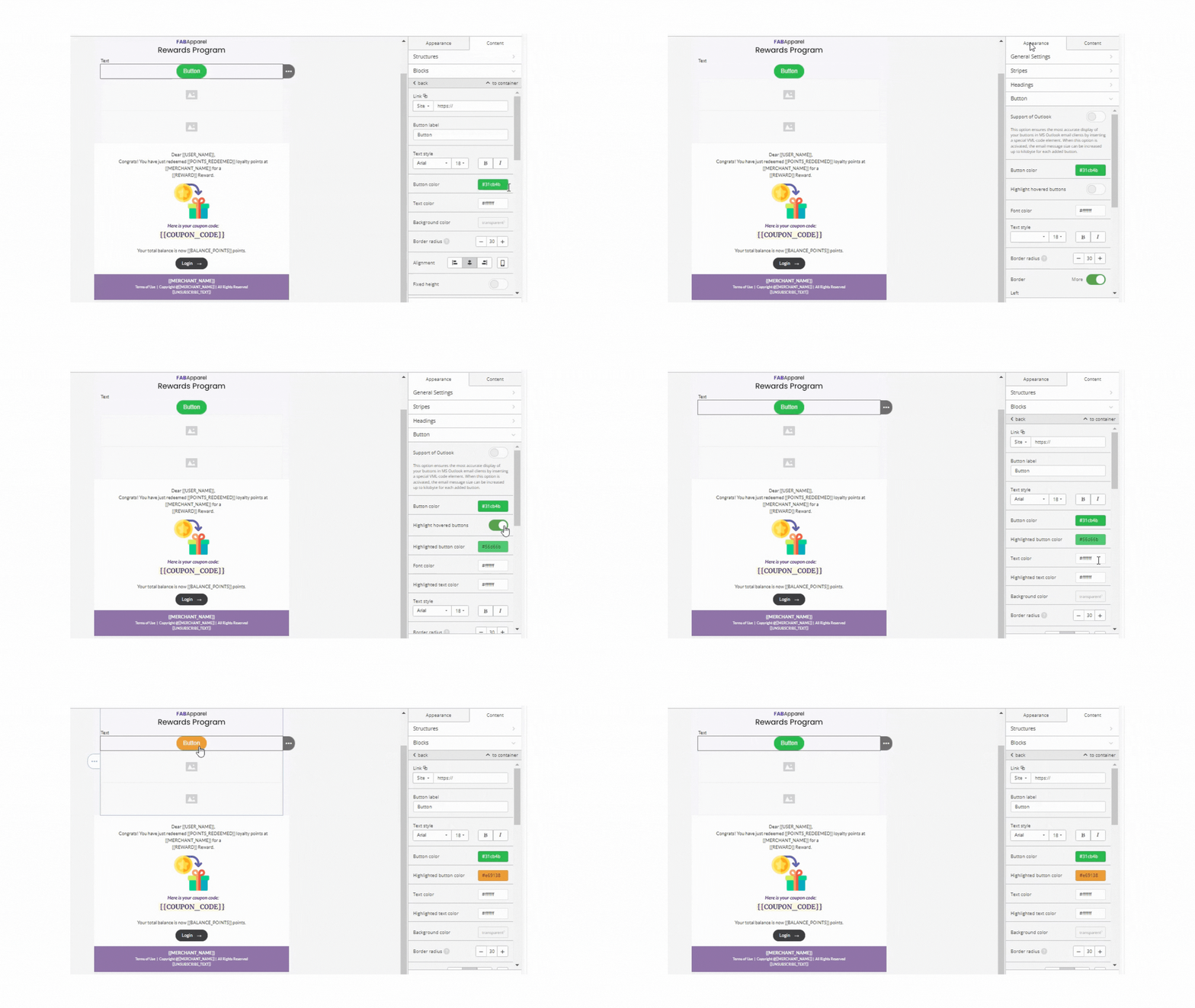
You can enable the "Highlight hovered buttons" feature in the Appearance tab and modify the color in the Content tab (Button block).
In the accompanying screenshot, the "button color" refers to the primary color, while the highlighted button color represents what users will see when hovering the mouse. The text color is for the font.
- Adjust the button's width: This will change the button width to stretch to its container's width. Button dimensions can be changed using the Size property.

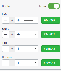
- Set a border around the button.
- Set internal padding, which determines the space within the button.
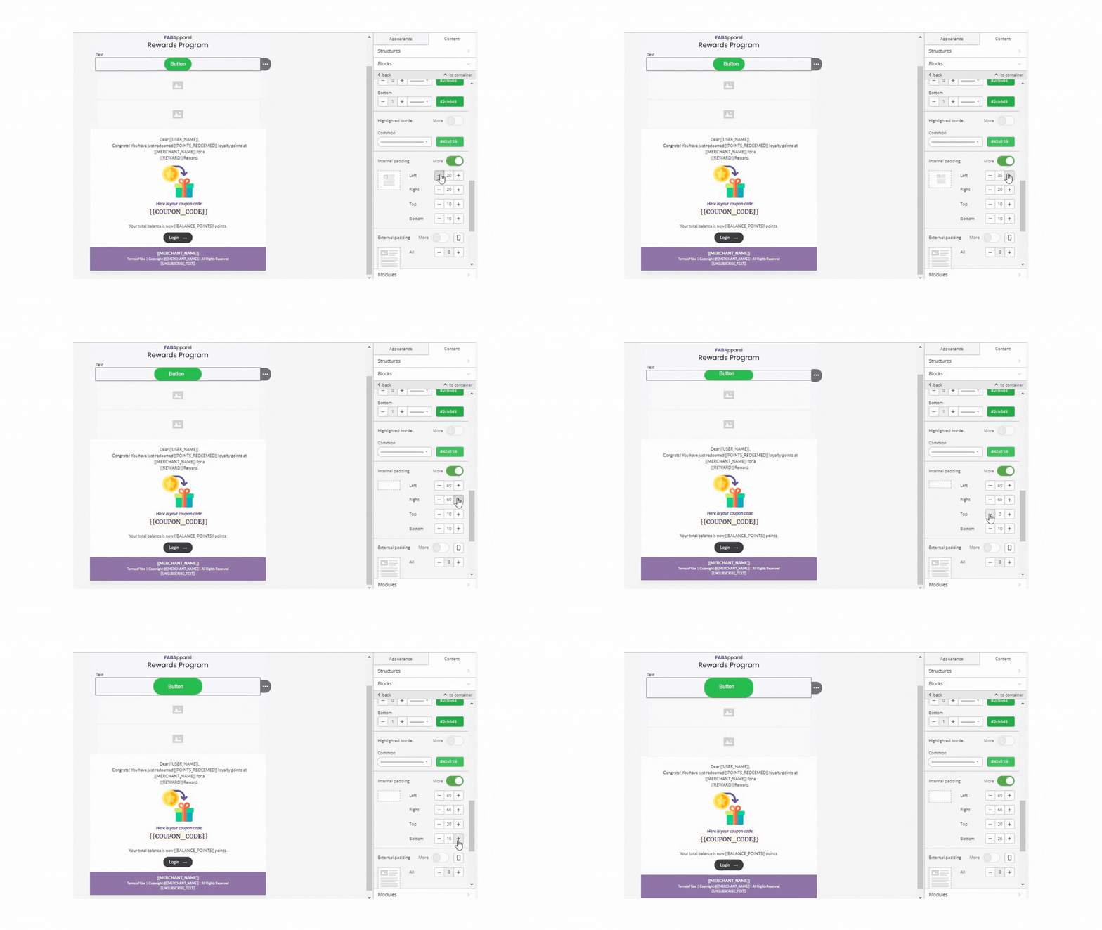
- Define external padding, which creates whitespace outside the button but within its container. By clicking on the mobile icon, you can apply different external padding settings specifically for mobile devices.

- You can include an icon in the button.

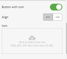
Note that this feature is not supported in Windows Outlook versions 2002, 2007, 2010, 2013, 2016, and 2019.
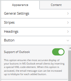
- If you anticipate that some recipients will use Outlook, make sure to activate the "Support for Outlook" option. This feature ensures optimal rendering of your buttons in MS Outlook email clients by embedding a specific VML-code element. Remember that enabling this option may increase the email's size by several kilobytes for each button added.
Spacer

A spacer enhances the visual layout of your email, creating a well-organized and aesthetically pleasing design.
- Insert a One-Column Structure: Begin by adding a one-column structure to your email template.
- Access the Settings Panel: Double-click the Spacer block to open its settings panel.
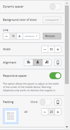
- Add the Spacer Block: Drag and drop the Spacer block into the column.
- Dynamic Spacer: Manually adjust the spacer size to create a dynamic effect.
- Background color of block: Choose a background color for the spacer to match your email design.
- Line: Define the spacer's thickness by entering a numerical value in the Border field. Also, you can select a line style: solid, dashed, or dotted, as per your design preference.
- Width: Specify the spacer’s width:
- Alignment: By default, the spacer is centered. Adjust the alignment in the Alignment section if needed.
- Responsive Spacer: Turn on the Responsive Spacer option to ensure proper display on mobile devices.
- Padding: If necessary, set additional padding to customize the spacing around the block.
Video Block

Incorporating videos into your emails is a powerful way to capture attention and effectively communicate your message.
Methods for Adding Videos
There are two ways of adding videos in your email templates:
- Inserting a URL Link to Your Video
- Embedding a Video Player Directly into the Email
Method 1: Inserting a URL Link
A video URL is a reliable approach ensuring compatibility across all email clients and devices.
- Add a Video Block to the email template. And click on the video container to open the settings panel.
- In the settings panel:
- Paste the video link from YouTube, Vimeo, or TikTok in “Link to Video.”
- The system will automatically populate the "Alternate Text" field.
- Choose the color of the Play Button.
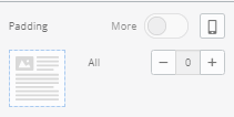
- Adjust alignment, size, and padding.
- Enable "Adjust to Width" for responsiveness.
- Turn on "Responsive Image" for mobile optimization.
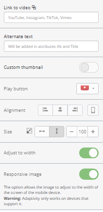
Note: Only links from YouTube, Vimeo, and TikTok are supported.
The system will automatically generate thumbnail for the video, but if you want to set custom one, follow these steps:
- Enable "Custom Thumbnail."
- Upload your preferred image or animated GIF for a visually engaging preview.
- Save the changes.

Important: The play button will overlay the thumbnail unless you disable it.
Method 2: Embedding a Video Player Directly in an Email
Embedding a video player allows recipients to watch the video directly within the email. However, this method is incompatible, as most email clients don’t support direct video playback.
Supported Email Clients:
- Outlook 2011 and 2013 for Mac OS
- AppleMail on MacBook
- iPhone 7, 8 and X.
Steps to Embed a Video Player:
- Ensure your video is uploaded to your own server in MP4 or WEBM formats.
- Add an HTML Block to your template.
- Paste the code into the block.
<video class="adapt-img" controls="controls" poster="https://zinrelo.email/content/guids/videoImgGuid/images/image16586923322854343.png" width="100%" height="313"> <source src="http://www.w3schools.com/html/mov_bbb.mp4" type="video/mp4"> <source src="http://www.w3schools.com/html/mov_bbb.webm" type="video/webm">

<!-- fallback -->

<a href="https://www.youtube.com/watch?v=ryqOEPk51Lg/" class="esd-frame-element esd-hover-element esdev-disable-select"> <img class="adapt-img" src="https://zinrelo.email/content/guids/videoImgGuid/images/image16586923322854343.png" alt="" width="100%" height="313"></a></video>
- Update the code with your video details:
- Replace the "Poster" link with the thumbnail image URL.
- Replace the MP4 and WEBM video links with your hosted video files.
- Add fallback links for email clients that don’t support embedded videos.
Key Notes:
- For unsupported email clients, recipients will be redirected to the fallback video page.
- Use embedded videos sparingly, as support is limited across platforms.
Social Networks

A "Follow us on social media" section is commonly included in emails to encourage subscribers to connect on various platforms. This is achieved by using the "Social" block.
Here are the steps to use Social Network blocks:
- Background color: Choose a background color for the social networks to match your email design.

- Insert the "Social" Block: Drag the block into your email template.
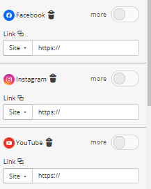
- Select a Design Style: Choose a style for the icons that matches your branding. Initially, four icons are displayed. To include additional platforms, click the "+" button.
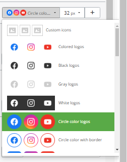
- Pick the Platforms: Keep the social media icons you want to include and delete the unwanted one. And enter the corresponding links for each platform.
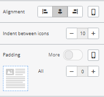
- Refine Layout: Modify paddings, alignments, and spacing between icons as needed.
Banner
The banner is a key element in email design. It is often used to highlight the main offer and instantly grab users' attention.
- Add the Banner Block: Drag the "Banner" block into a 1-column layout in the email template.
- Open Settings Panel: Click the banner block to access its settings panel.
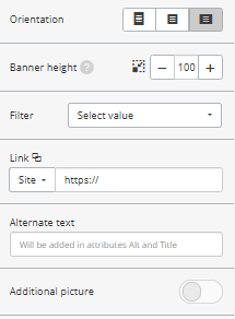
- Orientation: Adjust the orientation to align the banner as needed.
- Banner Height: The "Banner height" option defines the cropping area.
- Filters: Choose filters to enhance the banner's visual appeal.
- Link: Insert a URL to direct recipients to the relevant content or offer.
- Alternate Text: Provide descriptive text to display if images fail to load.
- Additional Picture: Choose an image that best represents your offer or content.
- Add Text to the Banner:
- Click the "T" button in the settings panel.
- When the button lights up, click the image to enable text editing.
- Replace the default "Caption" label with your desired text.
- Adjust the font size, type, and color to suit your banner's design.
- Choose a font style that complements your email design.

Menu

The Menu block is typically placed in the email header to guide recipients to key pages on your website or specific sections within the email. Menus often include your company's logo, making them both functional and visually appealing.
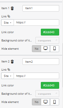
- Insert the Menu Block: Drag the Menu block into your email template. By default, the editor includes three menu items, but you can add more as needed.

- Configure Menu Items: Rename each menu item to reflect its purpose. Insert the corresponding URL links to direct users to the appropriate page or section.
- Menu Bar
- Choose between "Icons," "Links," or "Icons and Links" in the settings panel.
- Icons: Add images as part of your menu.
- Links: Use text titles for menu options.
- Icons and Links: Combine both for a more detailed menu.
- Choose between "Icons," "Links," or "Icons and Links" in the settings panel.

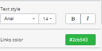
- Customize Appearance: Customize the color and font of the text. However, the color and font settings from the "General Settings" are automatically applied to menu links.
- Alignment Options: If using "Icons and Links," select an alignment style to position the icons and links cohesively.

- Adaptive Menu: Enable this feature to stack menu items vertically for better readability on mobile devices.
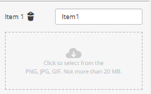
- Add Icons:
- If "Icons" or "Icons and Links" is selected, upload the desired icons for each menu item.
HTML

Sometimes, the editor tools must fully align with your design vision. In such cases, embedding custom HTML code is a practical alternative.
Steps to Add Custom HTML Code:
- Prepare Your Layout: If your email already has a single-column layout, remove it to create space for the HTML block.
- Add an HTML Block: Drag and drop a standard "HTML" block into your email design.
- Access the Code Editor:
- Click on the "Insert your HTML in the Code editor" option to open the Code editor.
- Copy your custom HTML code and paste it into the editor.
- Customize as Needed: Make any necessary adjustments to the code directly in the editor to fine-tune the design.
Updated 2 months ago
